IKEA × Windows high contrast mode
I recently spent some time checking IKEA.com in Windows high contrast mode, and found quite a few places where easy improvements could be made. There’s a handful of techniques that I used to do this that seem worth writing down, in the hope more people will benefit.
What is Windows high contrast mode?
Windows has a set of high contrast themes designed primarily for accessibility usecases. These can be turned on in Settings / Accessibility / Contrast themes. Although typically they appear to be a white-on-black theme, they’re unlike dark mode in that they don’t simply change the colour palette; they also make borders much more visible and in some cases thicker. And also unlike dark mode, they aren’t just simply exposed as a media query to webpages, but forcibly override colours and backgrounds on all pages. In practice, this normally means that your text and borders will be overridden to be white, and your background to black.
While great for people that need this level of contrast, the forced approach doesn’t always lead to perfectly working pages. As frontend developers we often produce overly complicated interface components, not realising that these might not end up looking like what we thought they would when they’re displayed on the user’s computer. The current preference for flat borderless design doesn’t help either: if we just rely on background colour to differentiate an element from its parent then we run the risk of both backgrounds being the same colour in Windows high contrast mode.
Luckily, there’s a range of techniques that we can use to better meet your user’s needs.
Make sure that elements have borders
If your high contrast users will need to distinguish an element from its container then you’ll need to make sure that it has a border in place. Sometimes it’s easiest to add a border of the same colour as the background of the element, but luckily there’s an even easier way: a transparent border will also render as white in high contrast mode. It’s not necessarily common knowledge, but background colours paint underneath borders so your element won’t look any different for users not using high contrast mode. Of course, if you set a border and a size, you’ll need to use box-sizing: border-box to retain its rendered size. Another useful trick: while background images don’t paint underneath borders by default (unlike background colours), adding background-origin: border-box will get them to do that.
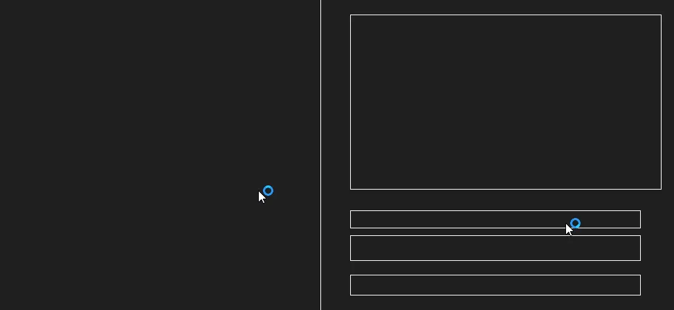
Once the element has a border then it will typically render as white in high contrast mode, providing your users with a visual indication of the end of one element and the start of the next. For example, by applying a transparent border to the default skeleton loading component, in high contrast mode it’ll render with an outline, successfully conveying the same meaning to the user.
Pick the right way to draw elements
There are many reasons to build custom interactive elements, for example functionality that the built-in element doesn’t support or the need to meet a brand requirement. However by using just CSS backgrounds, or an odd combination of backgrounds and borders, it’s possible to leave the user in a position where the components no longer work.
The simple fix is to paint everything that should be visible to the user with border colour. This makes sure that it’ll show up correctly. For example, IKEA’s radio button was previously using a border colour for the outline, and a background colour for the selected state’s central dot. By rendering the dot with a border colour rather than a background colour we can make sure it appears in high contrast mode.

Opting out from high contrast mode colour adjustment
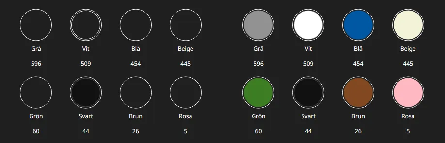
Obviously, you wouldn’t want to block high contrast mode in general, but there can be specific places in the system where you’d want to do this. Typically this is when you’re using coloured backgrounds and borders to build surrogate images. For an example, at IKEA we use background colours for the colour swatches in our search filters. Even though there’s also text, the swatches need to remain in place to make visual sense. By using the forced-color-adjust: none CSS rule applied just to the colour swatches, we can opt them out from high contrast mode and get the colours back.
Another example for this would be status icons, where both shape and colour are used to convey information.
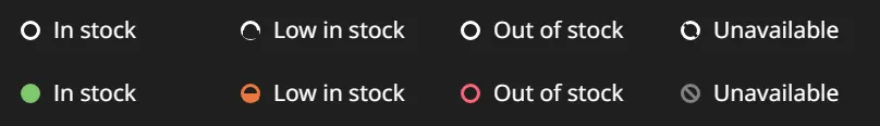
You should keep this usage to a necessary minimum. If you need to adjust specifically for high contrast mode then you should make sure that, where possible, your changes retain a high level of contrast.
Making specific adjustments for high contrast mode
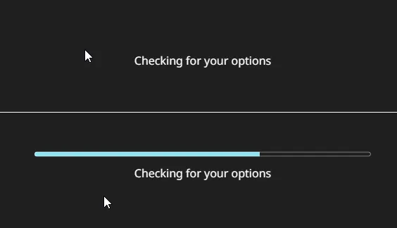
So on that subject, how do you tell if you’re in high contrast mode or not? Luckily we’ve got the forced-colors media query. But selecting for when we’re in high contrast mode (for example with @media (forced-colors: active)) we can make appropriate changes as necessary. For example, at IKEA we have custom styling for a loading bar, that’s based on the HTML progress element. As it’s somewhat tricky to style and completely broken in high constrast mode, the best thing was simply to use this media query to revert most of the styling, leaving us with a native display.
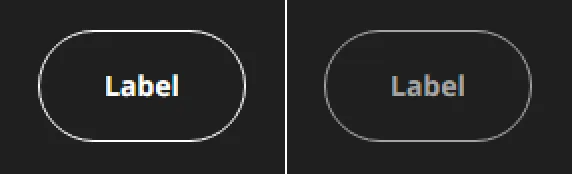
Another adjustment you can make inside a forced-colors media query is to help users understand what state your application is in, for example when you’re displaying disabled components. Although disabling user interface components is generally something to avoid, it’s necessary occasionally. Typically we do this by changing the colours used in the component to a palette of lighter greys. As we’ve seen above colours are set to white in high contrast mode; luckily CSS provides a series of system colours that we can use inside forced colours mode. One in particular is called GrayText, and is described as Disabled text. (Often, but not necessarily, gray.)
Perfect! We can then use that to change the colour of our borders and text to communicate disabled state to our users.
Further work
We’ve still got plenty more to do to make IKEA.com work well for high contrast mode users, and, more generally, users who set colours in their browsers that best meet their needs. Ensuring that our design system’s components support forced colours makes it more likely that the overall site will work for those users, and better documentation on the subject will help teams make their own interfaces more accessible.
Another area that we could investigate is building a variant of our design system designed to give a higher level of contrast. Systems like iOS, macOS and Android have high contrast settings that don’t specifically override website colours. Browsers will, however, expose the setting in CSS through the prefers-contrast media query. We could use this to change our colour tokens to do things like increase the contrast of the text or add additional borders, which still presenting the user with an experience that’s consistent with the IKEA brand. This sort of change needs to be carefully designed, but could have positive benefits for a good number of users.